
Ocure is a brand that One iDea is powering in the healthcare industry in India.
Healthcare Industry Tradition
The healthcare industry in India is laden with asset-heavy businesses with primarily a traditional footing. When we say traditional footing, you need to understand that the healthcare industry in India was based on the trust placed by patients on individual doctors for close to a century now. Be it modern medicine, ayurveda, homeopathy or any stream of medicine for that matter, patients followed the doctors wherever they went. So, this was a doctor-driven industry and the mission hospitals played a big role in running the hospitals apart from the government hospitals.
The Fast Changing Industry
Of late, the healthcare industry in India is changing its characteristics with the rise of corporate hospitals with investment funds. The Corporate Hospitals are trying all the tricks in marketing and branding to shift the patient’s trust on doctors to their brands. And they are investing heavily on the brands and the existing industry practices. For instance, as long as this generation can remember, almost every hospital in the country displayed the name of the doctors in front of the room in which doctors met the patients for Out-Patient Consulting. But now Corporate Hospitals have replaced the names of doctors with just the room numbers just to ensure that the patients don’t come to the hospitals focusing on a doctor of their choice.
The Strategy
&Matthai Strategy Consulting formulated the Strategy for the brand and the Strategy was briefed to the One iDea Brand Team working on the Brand Identity Programme. The Strategy was to focus on the ‘Care’ for the product brand and ‘Cure’ from the market perspective. Market being a group of customers in a specific geography. The brief was to focus on the prevalent feeling of the healthcare industry and give it a tinge of freshness. The Verbal Brand Identity and the Brand Voice was developed by the Soktrategy Implementation Team at Breakthrough Brand & Business Consulting.
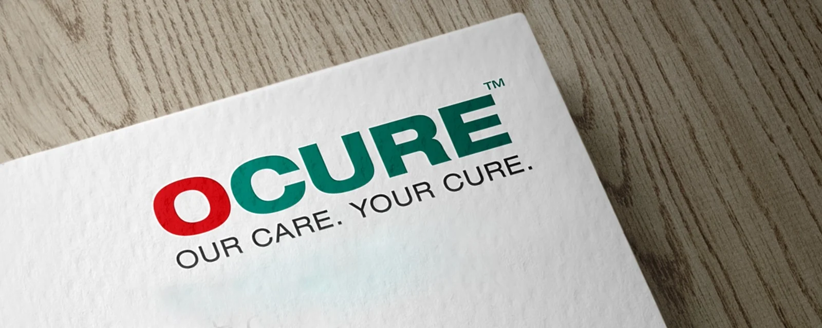
Ocure Brand Identity Programme
For the Ocure Brand Identity Programme, One iDea Brand Team decided to use the familiar colours that the people carried in their minds when they thought of a hospital. They brought in red from the most ubiquitous symbolism for hospitals – the red cross in a white patch or the reverse of it. Then they blended green into it to bring the natural state of equilibrium and wellness into the whole thought. The highlight placed on the alphabet ‘O’ is to focus on the main service provided by the brand – Orthopaedic Oncology. The typography was well thought out. The sans serif choice was obvious. The spaces and casing also gave a new dimension to its meaning in the healthcare industry. The logo is cool and will carry the reasoning on for many decades together. The whole idea was to bring in the new asset-light business model in healthcare with a perspective of tradition in the minds of the patients. It is to shift the focus back on the Doctors from the new trend of focusing on the brand without throwing the spotlight on the asset-light business model.